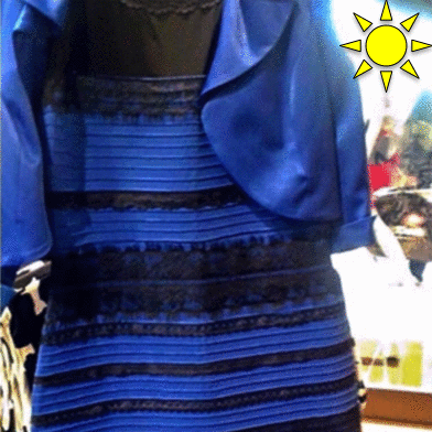
 When #thedress first came out in February 2015, vision scientists had plenty of ideas why some people might be seeing it differently than others, but no one knew for sure. Now we have some evidence as to what might be going on. The illumination source in the original image of the dress is unclear. It is unclear whether the image was taken in daylight or artificial light, and if the light comes from above or behind. If things are unclear, people assume that it was illuminated with the light that they have seen more often in the past. In general, the human visual system has to take the color of the illumination into account when determining the color of objects. This is called color
constancy. That’s why a sweater looks largely the same inside a house and outside, even though the wavelengths hitting the retina are very different (due to the different illumination). So if someone assumes blue light, they will mentally subtract that and see the image as yellow. If someone assumes yellow light, they will mentally subtract it and see blue. The sky is blue, so if someone assumes daylight, they will see the dress as gold.
Artificial incandescent light is relatively long-wavelength (appearing yellow-ish), so if someone assumes that, they will see it as blue. People who get up in the morning see more daylight in their lifetime and tend to see the dress as white and gold, people who
get up later and stay up late see more artificial light in their lifetime and tend to see the dress as black and blue.
This is a flashy result. Which should be concerning because scientific publishing seems to have traded off rigor with appeal in the past. However, I really do not believe that this was the case here. In terms of scientific standards, the paper has the following features:
*High power: > 13,000 participants
*Conservative p-value: Voluntarily adopted p < 0.01 as a reasonable significance threshold to guard against multiple comparison issues.
*Internal replication prior to publication: This led to a publication delay of over a year, but it is important to be sure.
*No excluding of participants or flexible stopping: Everyone who had taken the survey by the time of lodging the paper for review at the journal was included.
*#CitizenScience: As this effect holds up “in the wild”, it is reasonable to assume that it doesn’t fall apart outside of carefully controlled laboratory conditions.
*Open science: Shortly (once I put the infrastructure in place), data and analysis code will be made openly available for download. Also, the paper was published – on purpose – in an open-access journal.
Good science takes time and usually raises more questions than it answers. This is no exception. If you want to help us out, take this brief 5-minute survey. The more data we have, the more useful the data we already have becomes.
![]()
Finally? You could have asked a painter or a photographer two years ago. Perception of color is relative. See “white balance”.
Pascal,
Just took your follow-up survey on SurveyMonkey and noticed the image of the “flip-flops” was not shown on the page. I found it via the HTML source. Buzzfeed may be blocking direct image embedding from other sites on their servers; many high-volume sites do this.
Anyway, I don’t know if contrast is an issue, but you may want to run half the surveys with a black background surrounding the images instead of white, assuming SM allows this. I can’t say it will have an impact, but splitting the backgrounds will be sure to eliminate any effect.
Cheers,
Sam.
I would suggest that you add a metric for latitude, or for how much sunlight one is exposed to where one lives. I don’t quite fall into either the “lark” or “owl” category (although I’m getting more “lark-ish” with age), but live in Miami, FL, where I’m exposed to a lot of natural light, both at home and at work (where I have a nice, big office window facing south). I think that’s why my brain assumed that the dress was lit by sunlight.
I’m curious if there is any relationship between color sensitivity or color vision acuity and how one sees the dress. I sort of pride myself on having perfect color vision. I usually get a perfect score or close to it on those online color vision tests, such as the 100-hue color vision tests where you arrange the tiles by subtle differences in hue. So, being all confident and boastful about my perfect color vision, the dress drove me nuts! I absolutely saw what I assumed to be white and gold, though the original photo looked to me more like pale blue and sort of olive-mustard. But I assumed the murky colors were due to shadow and extrapolated white and gold. I even blew up the pic until I was seeing large pixels and never once found anything I could perceive as bright or dark blue and black, even when trying to force my brain to see it that way. So, I’m left wondering if there is any relationship between having better than average color perception and how one sees that crazy-making dress. Or maybe it’s just a non-factor?
@Sam: Thank you. It did work for most people. Background control is a good point.
@Travis: We get IP for free, and can derive long and lat from that. Most people probably wouldn’t know. But yes, the closer we can get to *actual* sunlight exposure, the better.
@Cheryl: I would not be surprised if that plays a role, but no one knows. We’re just at the (end of the?) beginning to understand this.